Our seventh project now for the Global Center on Cooperative Security – and certainly our biggest for them yet. The Global Center partnered with the Australian Department of Home Affairs to publish a 68 page Compendium of Good Practices in the Rehabilitation and Reintegration of Violent Extremist Offenders. Global’s job was to research and write prose around the 300 references they’d sourced and our job was to lead on the publicaiton design and print management.
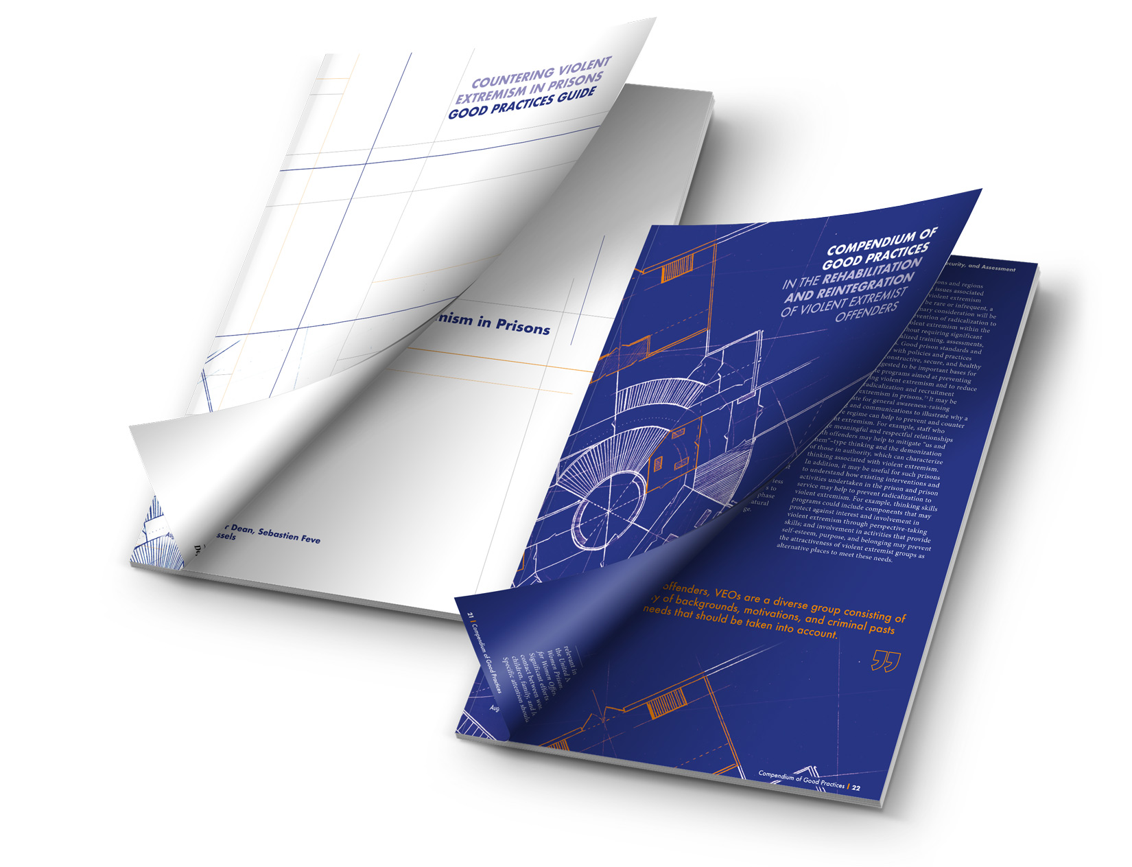
With the document hot off the processes this August, We couldn’t be happier with the end results. Here’s a little on our creative process on this one: After a series of three creative routes were presented within the first month of the project we had a clear winner. An idea was forming around utilising a blue-print theme throughout the document. This creative vision really tied in with the positive nature of the document where the good practices outlined focusses on the constructing of positive supportive environments around prisoners. We had hit on a creative route with symbolism. It became clear quite quickly that this creative route would grow beyond cosmetic function alone though as we started to create iconography and supporting motifs in tables that would enhance the learning process and make some of the great points even more memorable as they are brought to life visually.
The birds-eye view of a fictional prison was created for the cover followed by a series of fictional prison environments for the chapter covers. We focussed on the chapter covers not showing an ideal way to do things but merely the factors and considerations that should be in the minds of readers when thinking about prison management; or thinking about prisoner reintegration etc.

As we were keen to create authentic sketch style artwork – all assets were drawn by hand before being scanned and treated in Adobe Creative Suite. We utilised Global Center’s colour palette throughout the document using their blue frequently to convey the blue-print style and professionalism of the piece. We then used their brand orange sparingly as a highlight colour. Both colours and the white working perfectly together.
But our work didn’t stop with the 68 page document. We produced a 28 page Good Practices Guide that was a secondary deliverable to compliment the main publication. For this we worked to invert the style of the Compendium by opting for a clean white cover with recurring motifs and artwork featuring throughout. We also developed a microsite at veocompendium.org acting as a scaleable hub to house and download both documents. We are already working on phase 2 of veocompendium.org which will feature a fully searchable and indexable version of the Compendium copy itself.
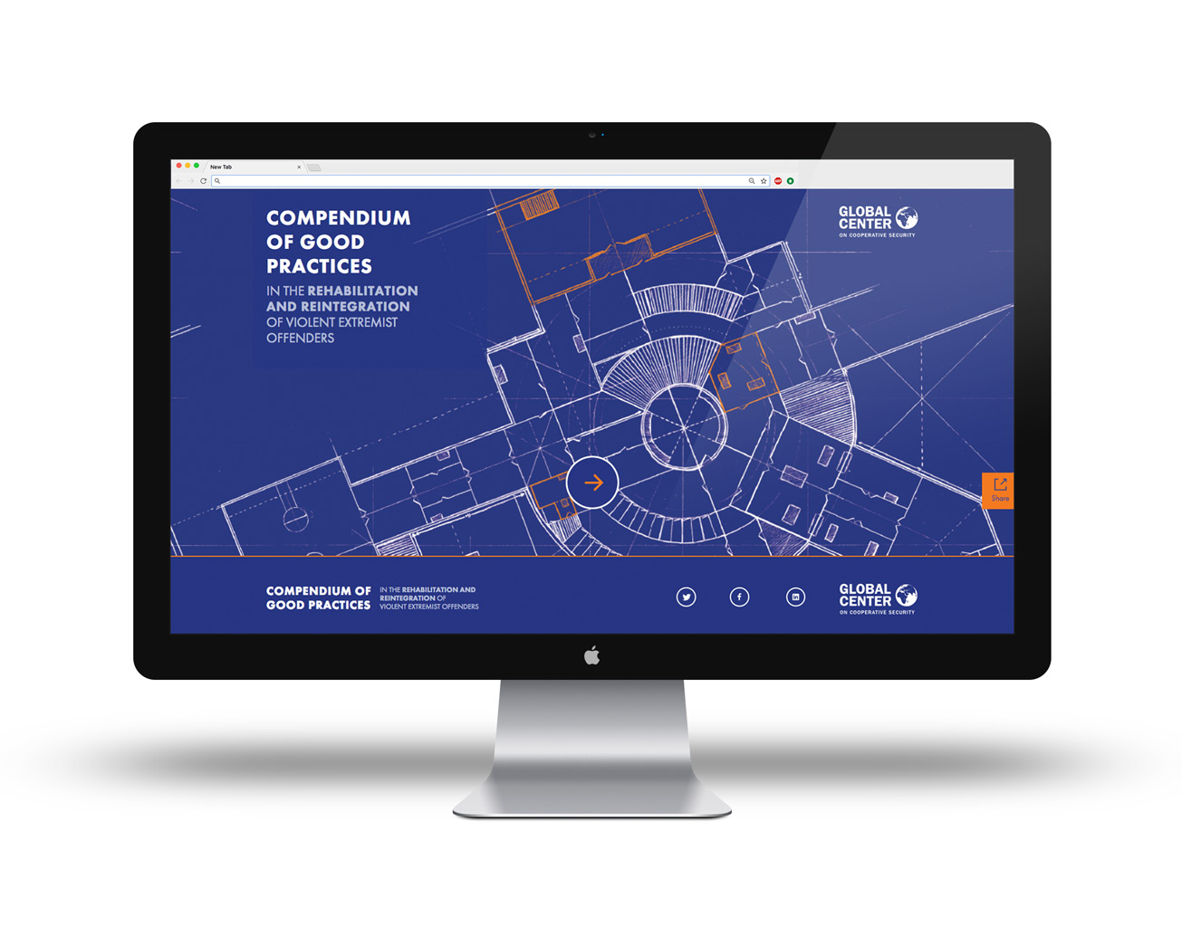
This is where our Studio You ‘Originals’ projects really come into there own. We help clients devise a multi-component cross-disciplinary project and we deal with co-ordinating the interplay between those different components. All in one project plan and you just have one dedicated rep to deal with your requests. This saves you having to co-ordinate project plans between agencies and be the go between yourself. On this project the creative concept was born out of the print design process and our web designers translated this concept into a responsive web design. The microsite was then being programmed as the publications were laid out with the final copy supplied by Global Centre.
After several rounds of team review and further strengthening of the publication designs we were ready for print. With our regular printers we hit the perfect finish for this document. Firstly we went for Digital Printing. Whereas once there was a huge difference – Xerox digital printing these days is incredibly high quality and not a million miles away from the top-end Offset Litho printing. Unless you’re trying to match specific brand pantones digital printing really can produce the quality at good prices. Particularly if you invest in the right finish. For this report we went for a 300gsm uncoated cover to give it a gorgeous matt look and feel; avoiding the risk of looking too flashy… and then 160gsm Uncoated Pages within. Allowing an extra day on your print process for PUR binding then allows a high-end glue that will really bind the document together nicely. PUR binding by the way is 40-60% stronger than “Perfect Binding” which uses weaker substances in the adhesives.
